Everbank Rebrand
(May 2012 – May 2014)
Digital User Experience Designer
My employment with EverBank gave me the opportunity to dive back into the field of web development. I helped maintain the websites of EverBank as well as created landing pages and emails as needed for campaigns. I regularly attended meetings with various stakeholders of different projects to better understand ongoing campaigns within the marketing department. As an advocate for a good user experience, I never hesitated to bring new thoughts to the table from the perspective of our customers. In February 2013, we rebranded and launched a fully responsive website to better serve our clients and customers. This gave me the chance to create and define interactions within parts of the website.
Holiday Hours
In our new website, I defined an easier way to show our holiday hours that would work well in our responsive framework . As EverBank is a relatively small bank with multiple divisions, the hours of operations in each vary and so it is important to differentiate them for our customers. Previously, we had displayed them in a table format. The holidays were listed in the first column and the four main divisions of EverBank were listed in the header row. The table was not responsive and quite cluttered.
While I was drafting up ideas, I thought about the times that I searched for holiday hours of a particular company. I realized that for the most part, I looked for the hours for an upcoming holiday. I rarely searched for holiday hours farther than 2 months away. After speaking with some colleagues around me, I discovered that I wasn’t alone. Most people are looking for information in regards to closer holidays because it affects their upcoming/short-term schedule in some way.
The final design can be found here, with mobile view snapshots shown below. (Update on April 9: EverBank was acquired in June 2017 by TIAA Bank and they have updated the page to only show two divisions.)
Below are some of the early ideations and wireframes.
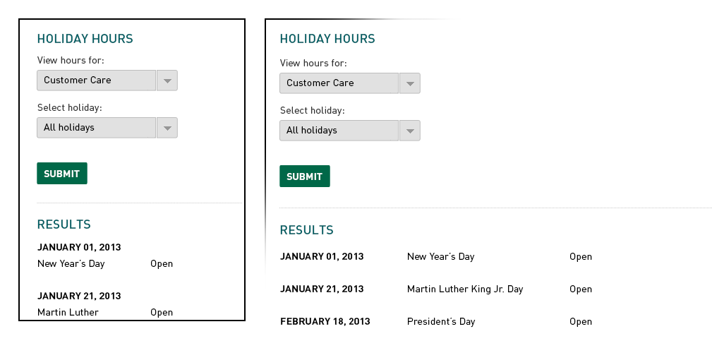
In the first slide, the user is able to select a specific holiday hour and division. By default, it shows the ‘Customer Care’ division and all of the holidays. In mobile view however, it takes up a lot of vertical real estate and as the year goes on, it shows past holidays which no longer matter to the consumer.
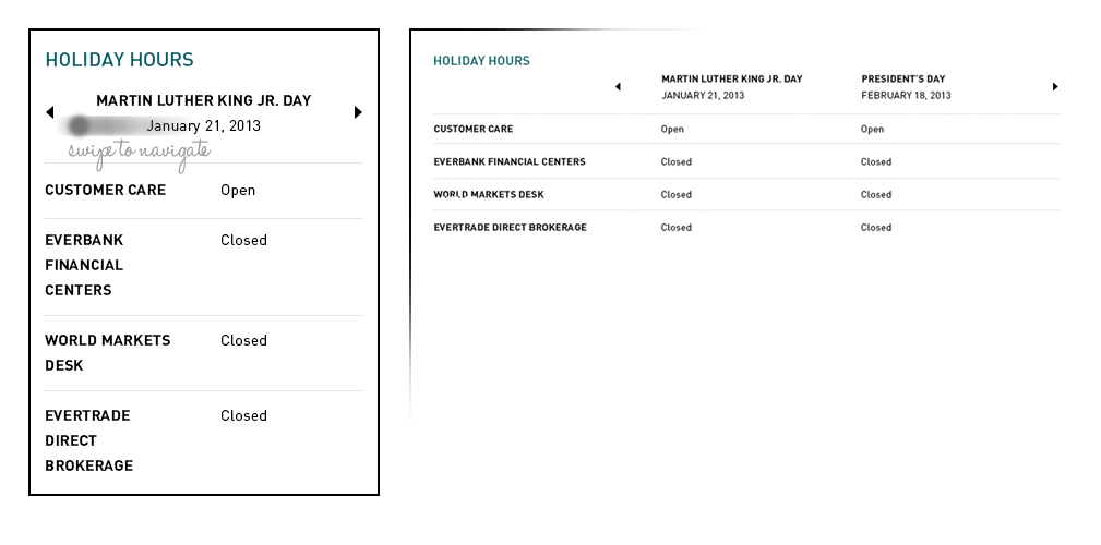
In the second slide, we displayed all four divisions but only the hours for one or two upcoming holidays, depending on the view. Any previous holidays past the current date is hidden. Myself, along with the rest of my team found this very intuitive to the user. As we hypothesized that our customers were only interested in upcoming holidays. They are able to swipe to the left for future holidays and only holidays for the current year show.
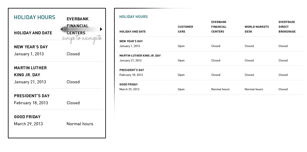
In the last slide, we displayed all four divisions as well as all holiday hours. In mobile view, the user swipes across the top for each division. The issue here again was that previous holidays would show. Additionally, some of our customers have accounts in more than one division and this view does not show them all of the hours at once in mobile view. The table format can also be hard to read in the desktop view, which is the same issue as the way it was previously displayed.
Business Properties for Sale
Another area of the website re-brand I took part in was the information display of the properties for sale page. EverBank owns a number of properties through foreclosures and these get listed onto our site for those who are interested in purchasing them. I had the opportunity to design the most efficient way to display the information between two platforms, desktop and mobile. Since this was a website, the change in the display was done purely through CSS.